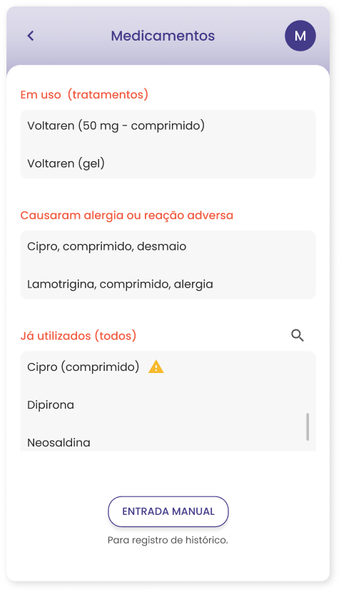
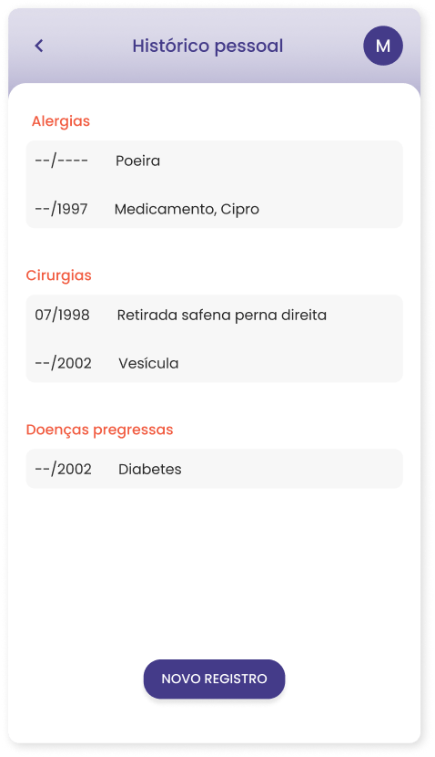
On the one hand, everybody suffers, at some point in their lives, remembering details of their health history, symptoms, or their family health history. On the other hand, physicians suffer from the poor quality of information they receive to reach a diagnosis.
The challenge was to find a way to improve the quality of information people provide to improve the diagnosis process.
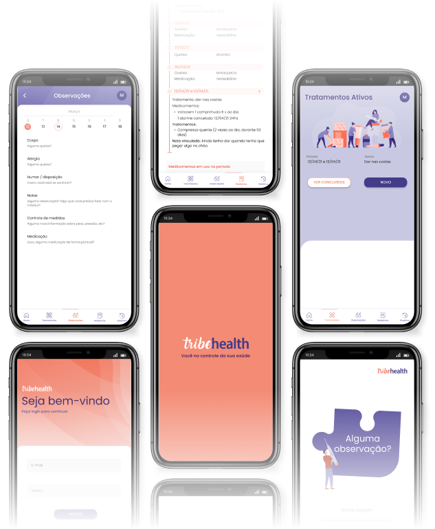
By logging all information for health treatments (such as alarms for medications, a task most users already do) the app would automatically begin to generate health history reports that would deliver a higher quality of information to the doctors.
My role
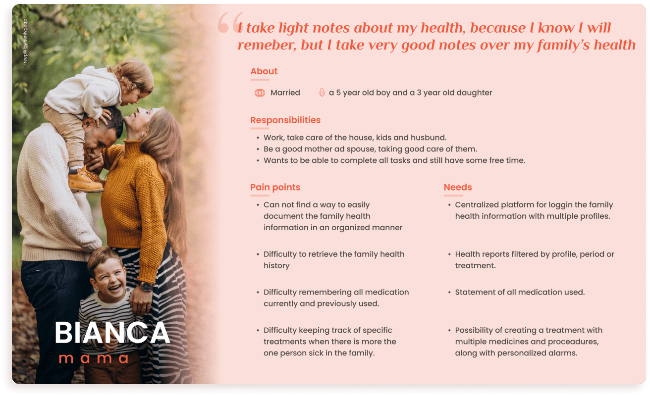
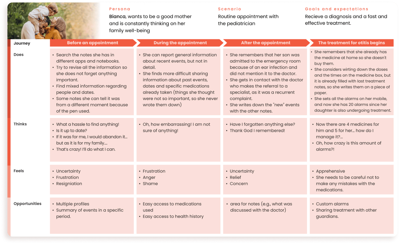
This was a solo project. I executed everything from interviews, mapping the user journeys, definition of the main persona, creation of prototypes, and conducting usability tests with the wireframe and the final version using the Maze platform.
Research
I started this study case with a hypothesis, that the information about family health history was an important data that most clients failed to provide accurately to their family doctors.
And after a couple of interviews with patients and doctors, I found out that this was a failed hypothesis. Although this is important information, the biggest complaint from both sides rested on the lack of information about recent events.
Based on this new finding I stipulated 11 hypotheses for validation through a survey using Google Forms. The findings were:

IDEATION AND BENCHMARK
With the bases defined (persona and needs), I started the ideation process trying to answer this question:
How might we help people create quality health history with low effort and aid the diagnostic process?
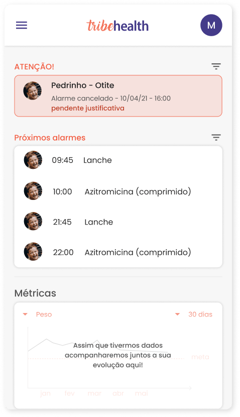
I came up with 6 ideas and the one prioritized was a mobile app, a health diary for any type of entry (e.g. mood, symptoms, etc), and logging and control of health treatments.
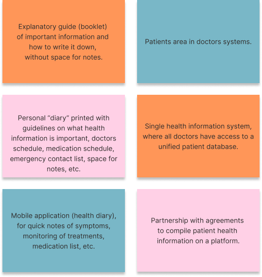
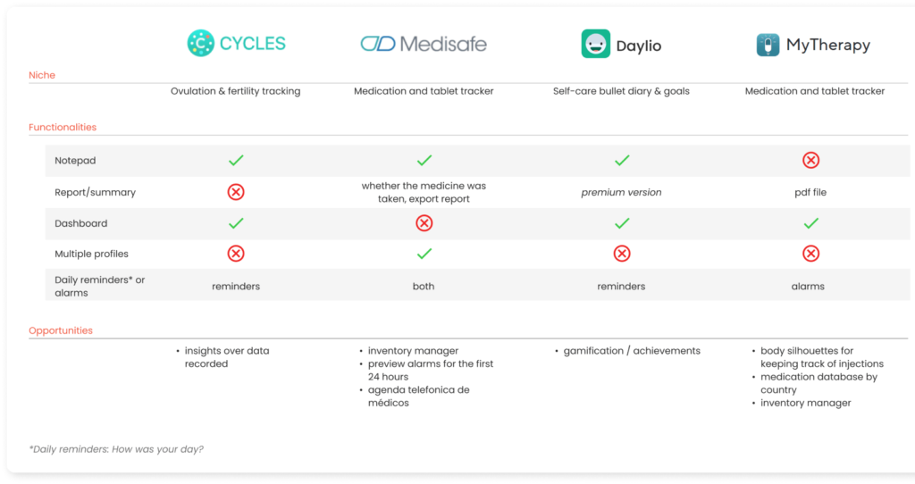
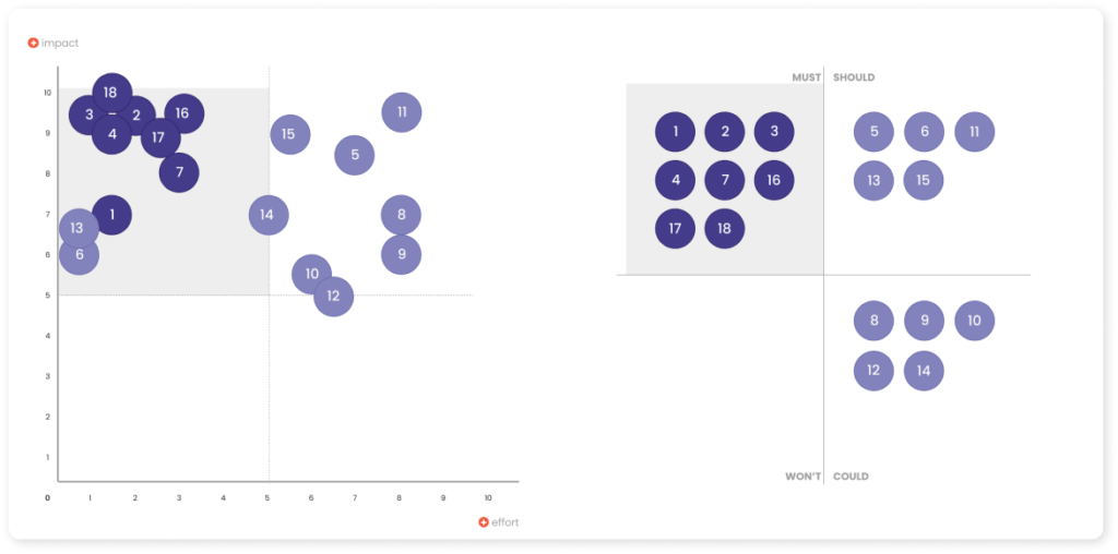
After this study, I came up with 18 possible functionalities. They were plotted on two matrices: MoSCoW and Impact and effort. The prioritized functionalities were:
- Ongoing health treatment log with personalized alarms and multiple profiles (propositions 2, 4, 16, 17, and 18)
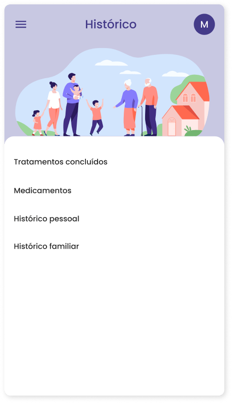
- Log of notes (e.g. symptoms, moods, etc), own health history, and family health history (propositions 1 e 7)
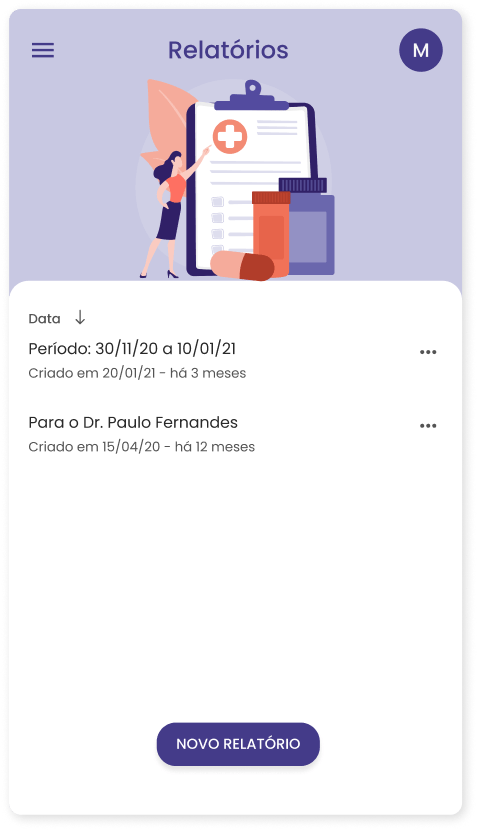
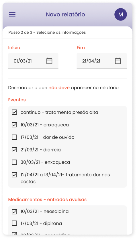
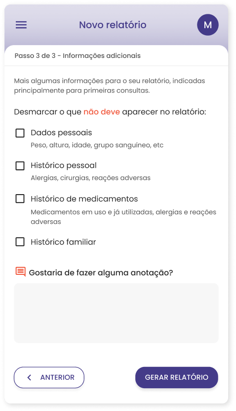
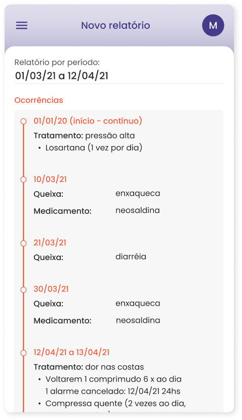
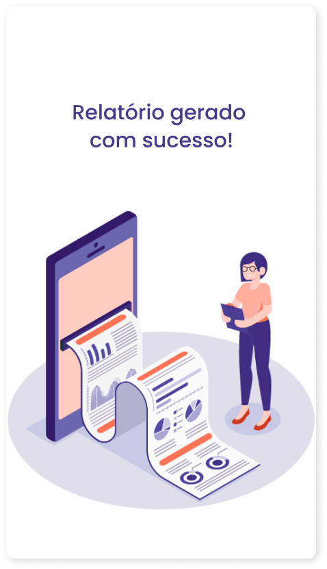
- Medical report generation
wireframe
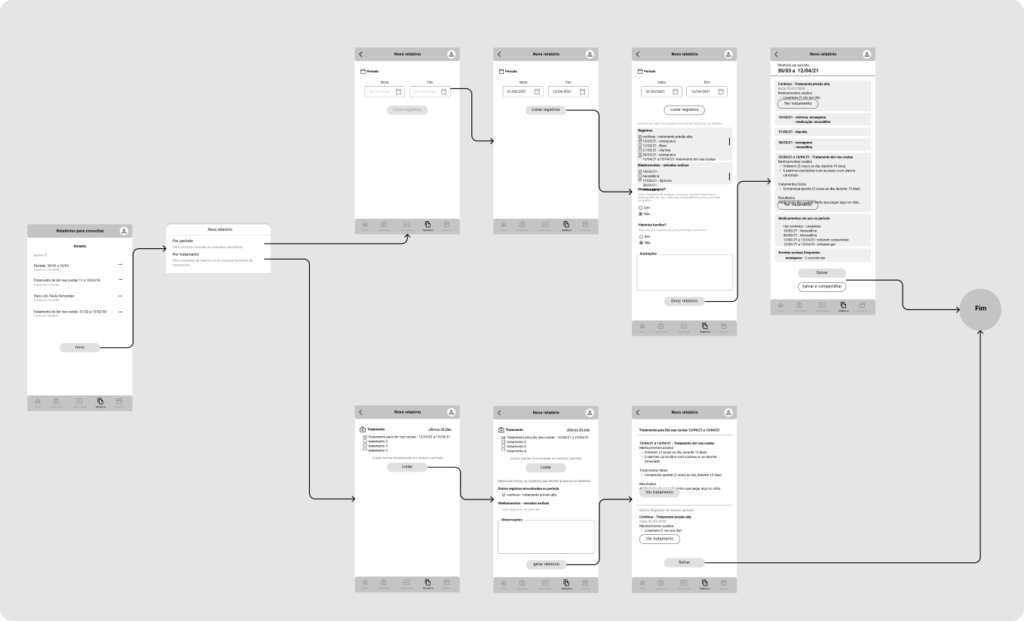
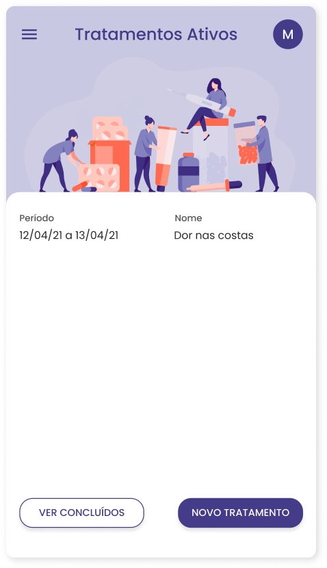
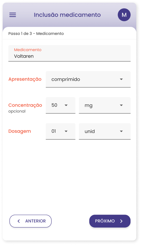
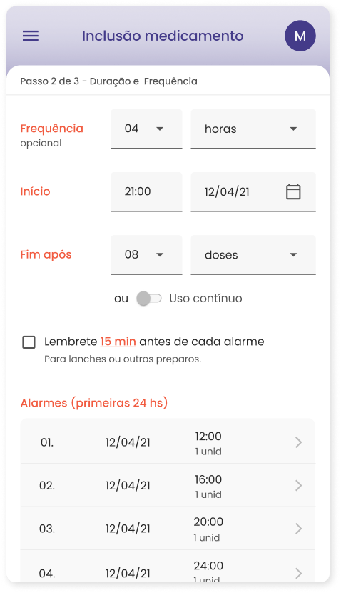
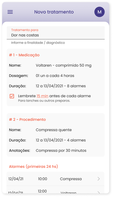
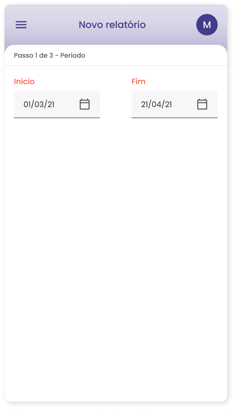
The first wireframes developed portrayed the creation of a health treatment and the generation of a health history report.
With these, I conducted guided usability tests through Zoom interviews that highlighted the need for a couple of adjustments, such as:
- the position of the action buttons from the top to the bottom
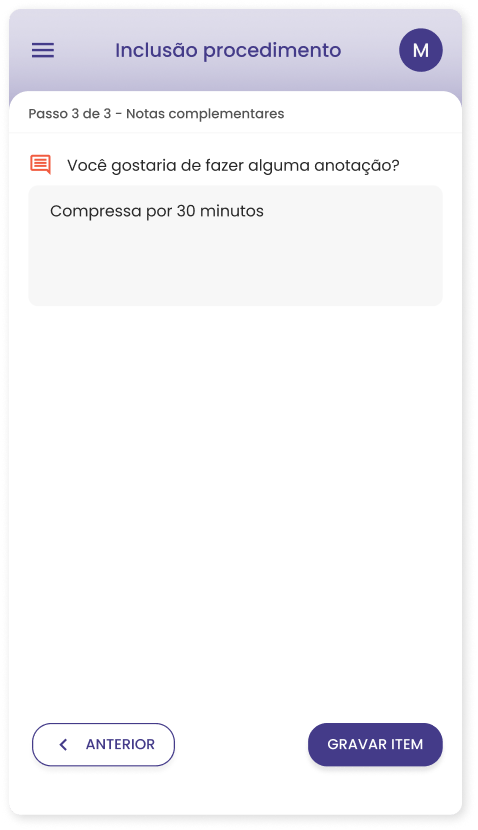
- the need for a better denomination for treatments that do not require a medicine (e.g: hot water compress)
- the need to better showcase the value of a report.
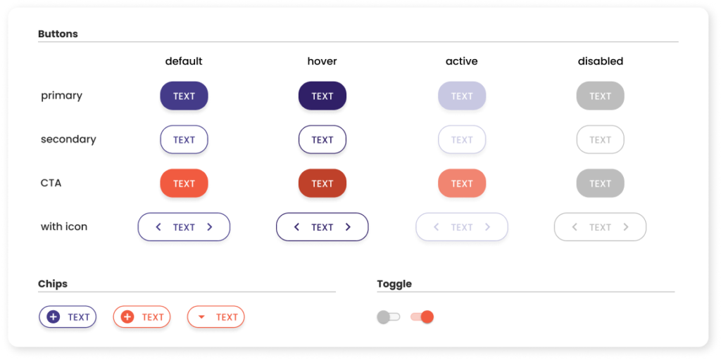
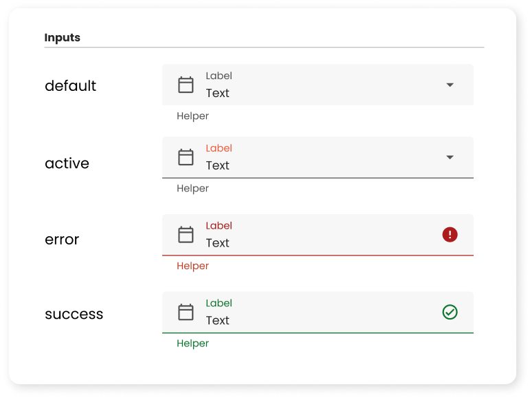
styleguide & components
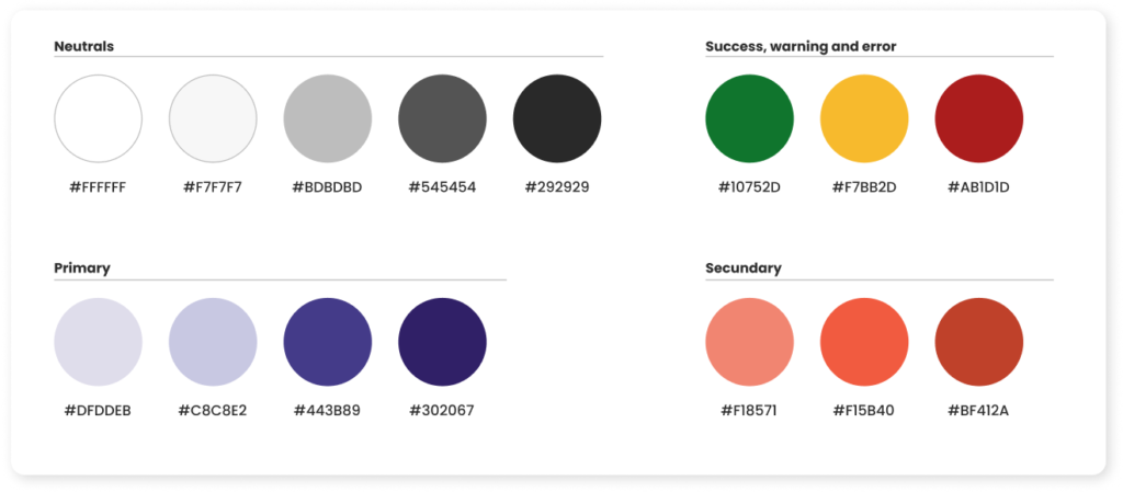
For the style guide of the app, I used blue for the primary, since it is a color widely used in health. For the secondary I chose a shade of orange, for warmth and since it relates to change for renovation.
Together they embody the main objective of this solution: an improvement in the user’s health.
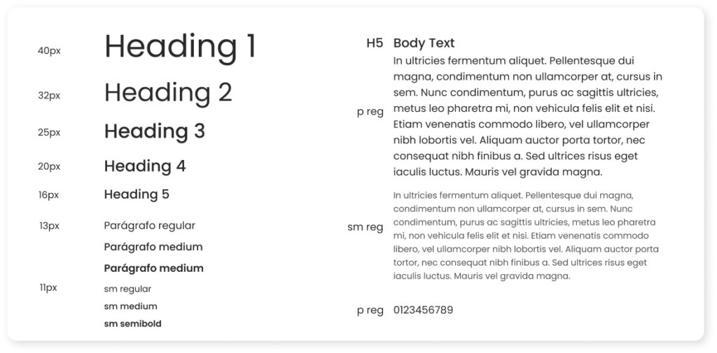
The typography used was Poppins, a flexible non-serif Google Font with 18 variations and I applied the Major Third scale for a better contrast between the levels.
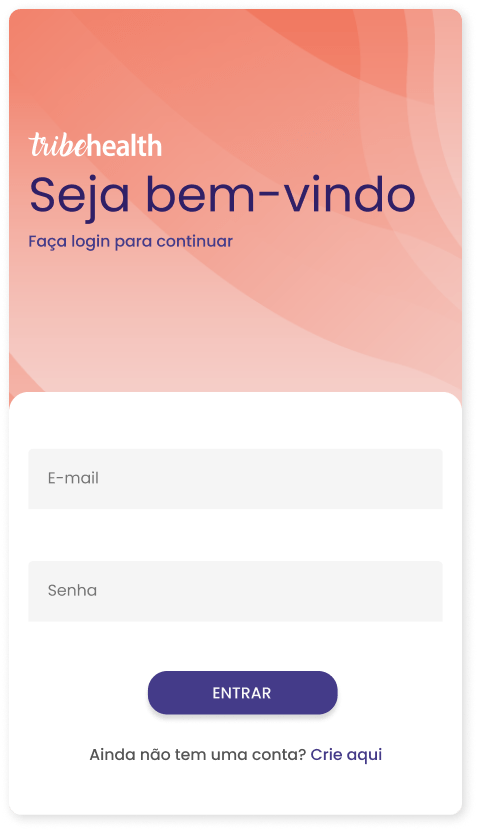
high-fidelity prototype
The prototype in the high-fidelity version was put to test using the platform Maze and through Zoom semi-structured interviews.
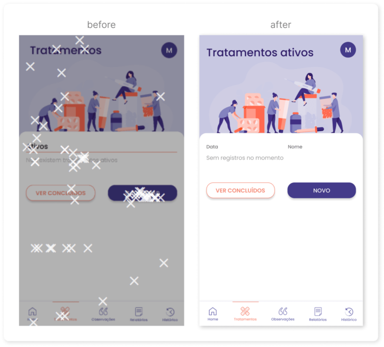
The goal was to confirm the level of difficulty in executing the tasks, understand the percentage of task conclusion, and identify new or persistent navigation problems with the application of the style guide. Hence,
- There was a need to adjust the small font up 1 size, to improve readability.
- It was pointed out that some screens had too much scrolling, therefore it was broken into steps whenever possible.
- It was not clear that the information on the reports was sorted chronologically, so I adjusted the layout with a timeline representation.
